>If I’d have found a blog to read 12+ months ago on textures and neutral palettes it would have saved me a fortune. I’ve always been a lover of the ‘farmhouse look’ I mean don’t get me wrong I’m a sucker for a minimalistic modern home but there’s just something about the farmhouse style that I always find myself drawn back too.
When we (meaning I) was purchasing items for our new build I automatically presumed the ‘new build style’ was white and grey, so of course I spent hundreds of pounds on white and grey items. I mean don’t get me wrong they were beautiful items and looked absolutely stunning, but I found myself a few months in feeling like it wasn’t quite right and wasn’t quite ‘my style’.
Slowly I started making small changes, small purchases... wicker belly baskets, softer more beige toned soft furnishings like throws and scatter cushions and that then escalated to painting the odd feature wall in soft beige/grey tones WHAT A DIFFERENCE, immediately our home started to feel cosier and warmer, ‘bizzare I know’ how neutral colours can warm up a room so much.
I’m not saying don’t have a grey and white home as they can and do look beautiful, all I’m getting at is, find your style, find items that make you feel cosy, whether that be a grey throw a beige throw or a bright green throw! (Do you) and style it to be the home you can’t wait to get back to every night
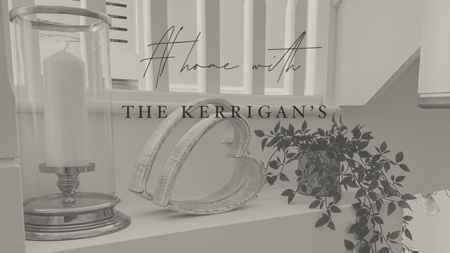
I’ve posted below some farrow and ball colour palettes hopefully these will help, I’ve also attached some corners of my home that I have styled up with different tones and textures along with some links to some of the items in the photos, just to give you an idea if your looking to soften up your home.
All my love
Victoria x
Victoria x


Marble bedside tables https://direct.asda.com/george/home-garden/coffee-side-tables/george-home-marble-side-table/001707975,default,pd.html
Mongolian faux fur cushion https://www.matalan.co.uk/product/detail/s2658074_c000/double-sided-mongolian-cushion-45cm-x-45cm-cream
No comments
Post a Comment